
Colour advice for kitchens tends to arrive as a list of shades with a year attached. That is a reasonable way to sell paint and a poor way to plan a room you will keep for two decades. A cabinet colour is not a wall colour. You cannot repaint it on a Saturday, it is bought in a finish that changes how it behaves, and it is always seen against a worktop, a floor and a metal.
So the more useful version of the question is not which colour to pick. It is which relationships hold up. This page covers the finish decision that sits underneath colour, the structures that tend to last, what white actually means in a New England kitchen, and how to test any of it before you commit.
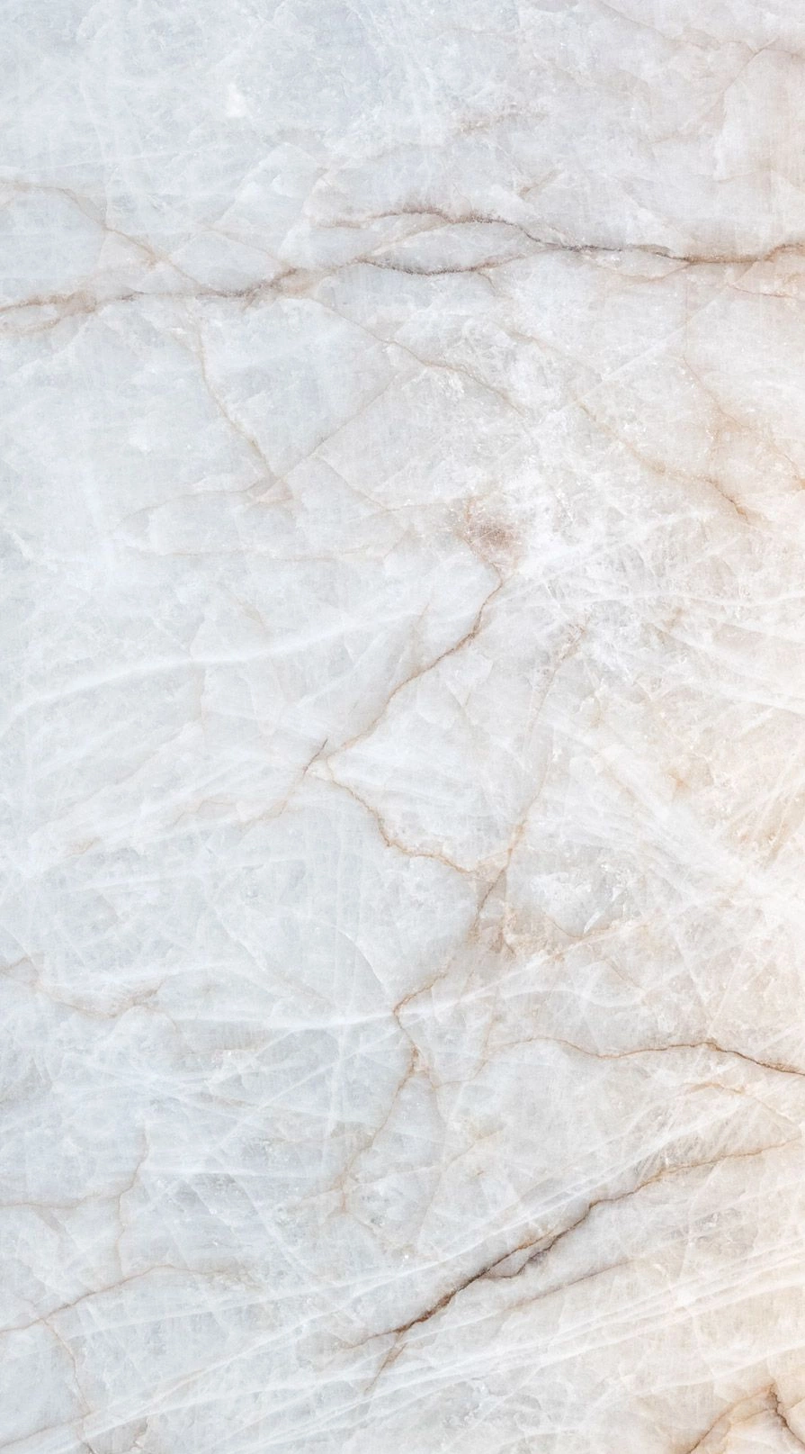
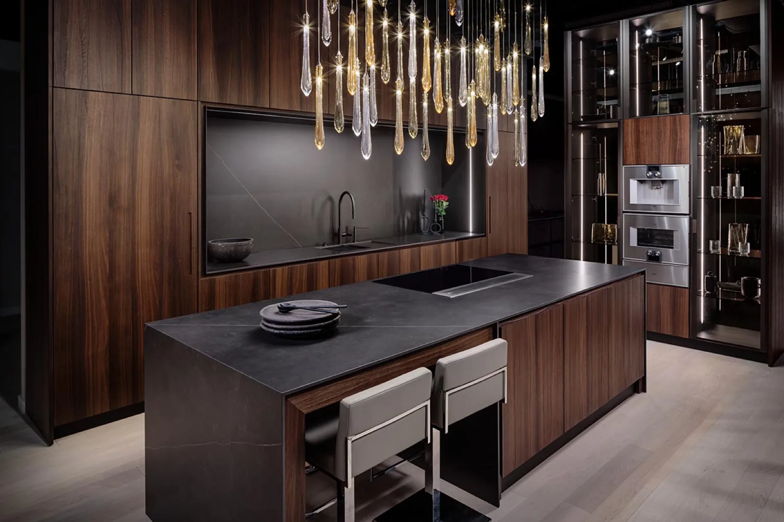
One correction worth making at the outset, because it appears in a great deal of kitchen colour writing. The veined worktops in the DOCA Brookline showroom are porcelain, not marble. That distinction matters for a colour conversation, because porcelain and stone do not take light the same way and they do not age the same way. Our materials page sets out the full palette.
Finish
The finish moves the colour further than the shade does.
Two cabinets in the same lacquer colour, one matte and one gloss, will not look like the same colour in the same room. This is the variable most people skip.
Absorbs light and holds the colour steady
A non-reflective surface helps conceal fingerprints and smudges, and the colour reads the same from most angles. The trade is that matte returns less light to the room, which a small or dim kitchen feels, and scratches show more readily than they do on gloss.
Reflects the room back at you
Gloss borrows brightness from a window and can lift a dim kitchen. It wipes clean easily. It also reflects everything else, including the ceiling light and whatever is on the counter, and it shows fingerprints.
Breaks the reflection without going flat
A texture scatters light across the surface, so a dark colour keeps some depth rather than turning into a void. It is the middle ground when matte feels heavy and gloss feels busy.
Adds a second variable you do not control
Grain has its own tone and direction, and it changes what a paired colour looks like. A cool grey next to walnut is a different decision from the same grey next to pale oak.
Timeless kitchen colour schemes, and why they last
Every kitchen colour article promises timelessness and then supplies a numbered list of this year's shades, which is a contradiction nobody acknowledges. The schemes that genuinely survive are not colours. They are structures, and there are four of them worth knowing.
One dominant colour and one supporting material
The palettes that age well are usually not palettes at all. They are a single decision about the cabinetry and a single decision about what it sits against. Adding a third and fourth colour is how a room starts to look assembled rather than designed.
Neutral above, weight below
Putting the darker or stronger colour on the base run and keeping the upper level quiet is a structure that has outlasted several decades of colour trends. It also happens to keep the eye level of the room light, which small kitchens benefit from.
Wood as the constant
A wood tone is far less likely to date than a painted colour, because it is not tied to a season. Rooms built around oak or walnut with a quiet second material tend to survive a change of taste without a repaint.
Colour on the island only
Concentrating the strong colour in one volume gives you the effect without committing the whole room to it. It is also the cheapest decision to reverse later, which is worth something.
What these have in common is restraint about how many decisions are being made at once. A room reads as considered when one material is clearly leading and the rest are supporting it. It reads as busy when four materials are competing for the same job, which is the usual failure mode of a palette assembled from images rather than from samples.
White kitchens
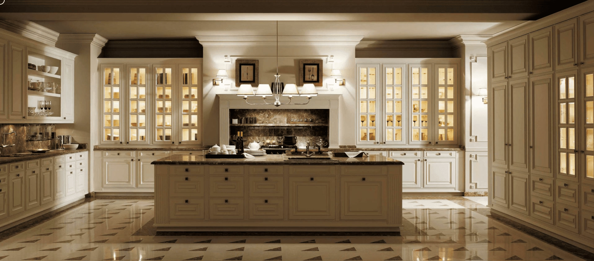
White is not a colour. It is a temperature decision.
The reason white kitchens sometimes disappoint is that white was treated as neutral. It is not. A cool white with a blue base and a warm white with a yellow base behave completely differently in a room that faces north, and most older Boston houses have at least one kitchen window doing exactly that.
Cool whites hold their crispness in bright, south-facing light and can turn grey and clinical when the light is flat. Warm whites keep some life in low light and can look creamy under strong sun. Neither is correct. The room decides.
The second half of a white kitchen is everything the white is next to. The worktop, the floor, the metal on the handles and taps and the backsplash all carry the actual character, because the cabinetry has stepped back to let them. A white kitchen is a decision to make those choices matter more, not less.
Local light
Cabinet colours and finishes for Boston houses.
New England light is not a design cliche. It is a long stretch of the year with a low sun, short afternoons and a lot of grey, and it changes which finishes work.
The practical consequence of low winter light is that reflection becomes useful. A gloss or textured door will pick up whatever daylight reaches it and put some of it back into the room, which a deep matte will not. That is an argument for finish rather than for choosing pale colours, and it is why a dark kitchen can work in a small Boston room while a different dark kitchen in the same room feels oppressive.
The second consequence is that artificial light does more of the work here than it does in a brighter climate. If the room is lit by a single warm ceiling fitting, every cool colour in it will be fighting that source for half the year. Light under the wall cabinets and a colour temperature you have actually chosen will do more for a palette than a different shade would.
Older housing stock adds its own constraint. In a house with original trim, a strong contemporary colour has to hold a conversation with woodwork you are not replacing. Sometimes that argues for pulling the kitchen toward the house. Sometimes it argues for a clean break. It is worth deciding which, rather than landing between the two by accident.
Where luxury actually comes from
Searches for a luxury colour palette usually turn up deep blues, brass and something described as jewel-toned. Those can look expensive. They can also look like a catalogue, and the difference is not the colour.
What reads as expensive in a kitchen is continuity. A grain direction that carries across a run of doors. A worktop whose veining is placed rather than accepted. Reveals that line up between a cabinet and the appliance next to it. Those are the things that cost effort, and they are visible to people who could not tell you why the room looks resolved.
Colour contributes to that, but only by staying out of its own way. One hero material per decision, contrast used sparingly, and a second material that supports rather than competes. See the DOCA collections for how the same principle plays out across modern, transitional, traditional and coastal directions, and the countertop guide for the surface half of the pairing.
Common questions about kitchen colour
What are the most timeless kitchen colour schemes?
The schemes that last are structural rather than fashionable. A single dominant cabinet colour against one supporting material, weight kept low in the room, and wood used as the constant will outlast any named trend colour. Palettes date when they depend on a specific shade being current, and they hold when they depend on a relationship between two materials.
Are white kitchen cabinets still a good choice?
Yes, provided you treat white as a decision rather than a default. White has a temperature, and a cool white in a north-facing Boston kitchen can read grey and cold for most of the year. Warm whites hold up better in low light. The other half of the decision is what the white sits against, because a white kitchen is really a decision about the worktop, the floor and the metal.
Is a dark kitchen a mistake in a small room?
Not necessarily, but the finish matters more than the colour does. A dark matte cabinet in a small room with little natural light will close the space down. The same colour in a textured or reflective finish, with light under the wall cabinets, behaves differently. The mistake is choosing the colour from a sample card and assuming the finish is a detail.
How do I test a kitchen colour before committing?
See the finish at full size, in the room it is going into, at the times of day you actually use the kitchen. A chip held under a showroom light tells you very little. Morning light, afternoon light and the artificial light you cook under at night will each give you a different colour, and the one that matters is the one you see most.
Does DOCA use marble worktops?
The veined worktops and waterfall surfaces in the Brookline showroom are porcelain, not marble. Natural stone may be appropriate in specific applications, but the material is named accurately for each project rather than described loosely. Large-format porcelain lets a veined pattern run across a long surface while standing up to heat and staining, and the exact performance depends on the slab, its thickness and how it is fabricated.
Continue